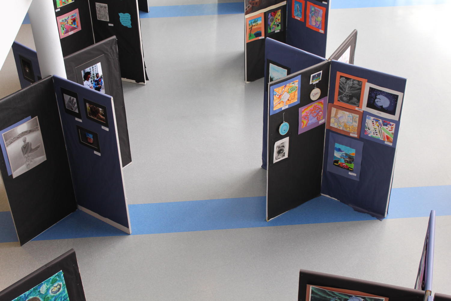
Between the arts, athletic and academic departments, our school has no shortage of talented students. With the winners of the Scholastic Arts and Writing Awards being recently released, our school has decided to display the artistic talent that we have to offer.
“It has been a tradition for, it could be forever. I don’t know how many years they have been doing it but you could say for over 30 years…. To share [a student’s work] with the community is a big part of being an artist,” art teacher Monika Stroik said.
Among all the amazing art pieces that were displayed, here are a few that stood out to me:
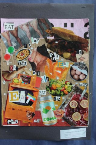
The first piece that I chose was the collage named EAT. This piece was created by AP art student Michaline Becknell. The reason that I chose this collage was because I felt that it stood out among the rest of the work. Becknell took a very different approach from all the other artists with her collage. She also used many different pictures that were able to tell a story.
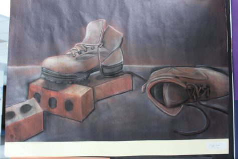
The drawing named On the Job by Art 2 student Kate Warne also found its way to grab my attention. The focus on the little details throughout the drawing didn’t go unnoticed. On the brick, the addition of the colors of black and gray allowed for the brick to have the classic textured look. Something else that really added to the drawing was the addition of a dark background. By making it dark, it made it so the subject of the photo was highlighted.
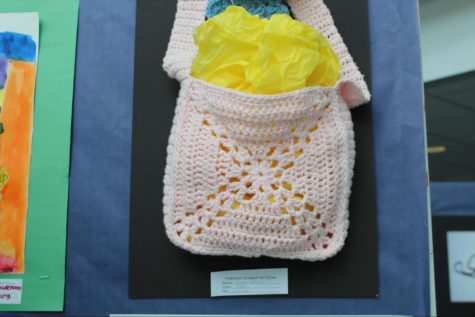
Another piece that also caught my attention was the piece named Crochet by Allison Jeffrey. This crocheted bag was very different from everyone else’s pieces. Where people would normally take the approach of a photo, drawing or painting, Jeffrey decided to focus on the aspects of crochet. The detail in the stitching to make the X design with the floral center as well as the blue crochet piece tied together to make an amazing project.
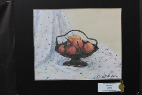
The next piece that stood out to me was the painting Oranges by the student artist Alice Rodin. This painting earned a gold key in the Scholastic awards and it is clear why. The detail on the cloth between the shadowing, folding, and the flower design added a lot to the painting. Also, the addition of shading on the oranges added a more realistic feel to the painting.
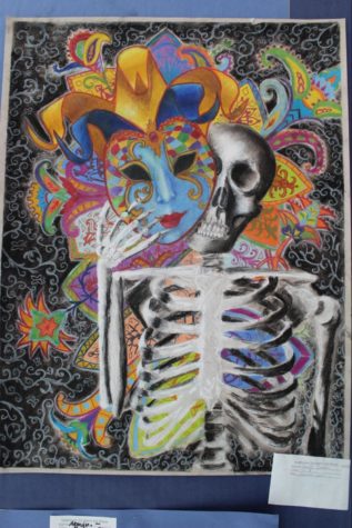
With the crazy colors and the abundance of design, it comes to no surprise that Taylor Sartori’s Momento Mori made an appearance. The addition of the bright colors on the head piece made a very clear and fun subject. With those colors also came the aspects of fun designs which added to this creative and amazing piece.
All the projects that were displayed show the skill and dedication that these student artists have. There was no way to showcase them all but I felt that these pieces were unique and deserved recognition.


