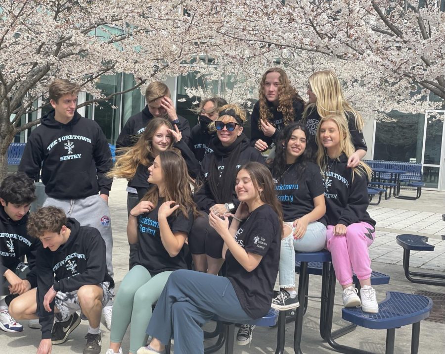


Different variations of our school’s logo have been popping up—in the atrium, on the website and in classrooms. Following this update, both students and faculty have raised concerns.
For the greater part of its history, our school’s logo has included a fleur-de-lis, an artistic rendering of a lily. The symbol originates in French décor, and its significance to our school stems from French aid in the Battle of Yorktown, our school’s namesake. But fret not Patriots, our logo is not to be forgotten, just updated.
Dr. Kevin Clark, our school’s Principal, was the leader in the rebranding endeavor.
“It’s not that we are replacing the logo, but just wanting to have a visual logo representing our school vision in addition to our traditional fleur-de-lis,” Clark said.
Since Clark became Principal, he has been working with the administration to define our school’s vision. Wanting a visual representation of this vision was the primary impetus behind the logo change.
“We did a lot of work in terms of thinking about what are the historical strengths of Yorktown around excellence and achievement. We also wanted to address some of the needs around equity at our school,” Clark said.
Clark and the administrative team at our school created several different iterations of the logo. They combine the three vision words—equity, excellence and empowerment, the fleur-de-lis and a crest in different ways. Though it is still undecided exactly how the different logos will be incorporated into the school, Clark ensures a continued appreciation for the old logo.
“I think eventually you’re going to see more branding around… balancing the traditional with the updated version,” Clark said.
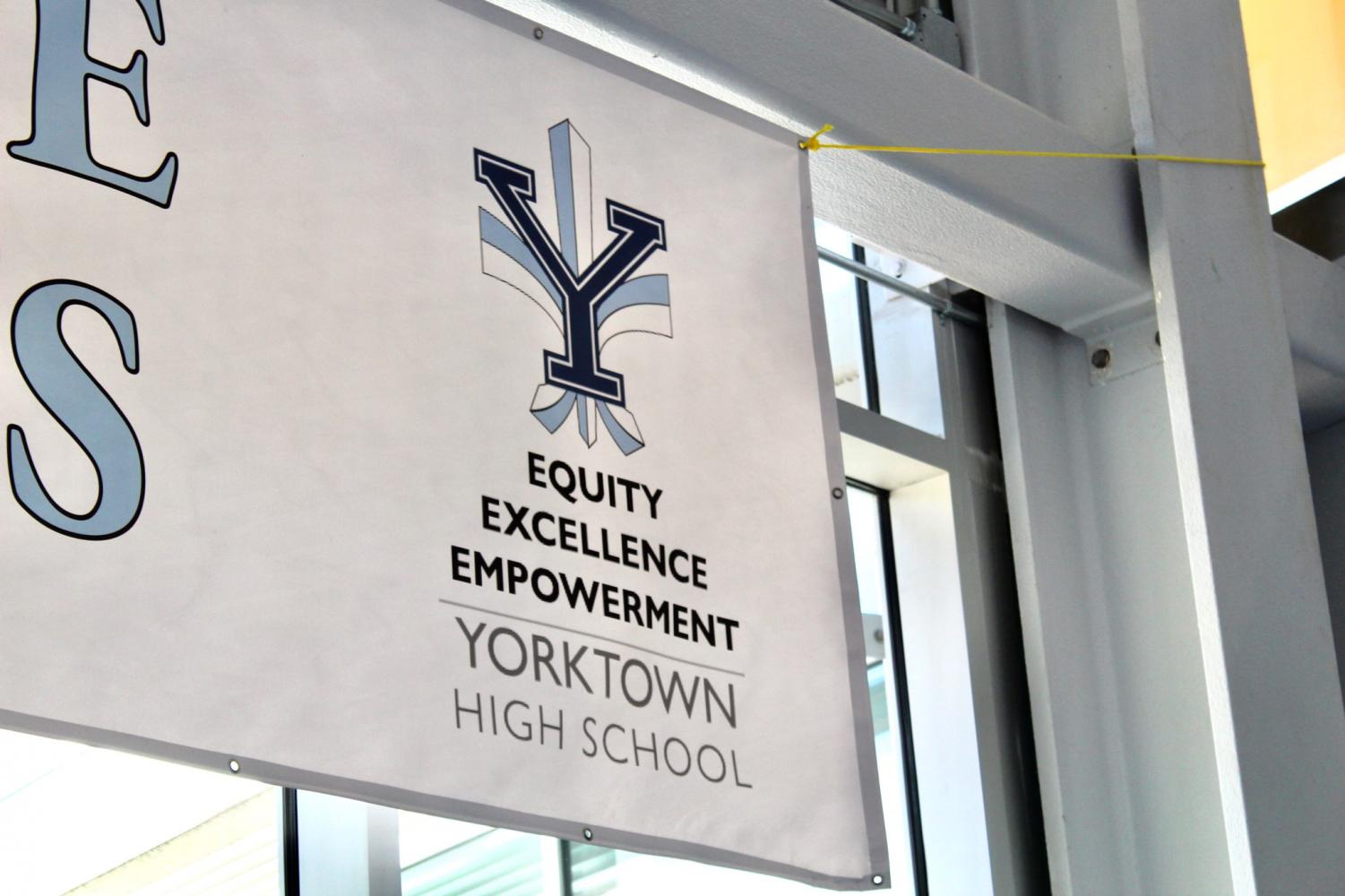
Currently, the logo that combines all aspects, traditional and recent, can be found on the large banner in the atrium. It includes the letter ‘Y’ and a fleur-de-lis, with the three words to represent the vision for our school below it. On our school’s website, a different variation can be found. There, the logo is just the ‘Y’ in a crest with the three words around its perimeter. This logo replacing the old one on our website caused a reaction among students and staff.
Physics teacher Scott Painter understands the objective of the words on the logo while also expressing his preference for the visual aspect of former iterations.
“I see putting the words there as a way to reinforce that these are three big areas that we are trying to put a lot of work towards… I’m in full support of the message it’s trying to send,” Painter said.
As different versions of the logo continue to fill the halls, it is crucial to keep in mind its purpose—not to replace the former, but to represent our school’s vision.